

Adding color to a kitchen design used to feel like a high-risk move. For years, white and beige dominated the landscape because they felt safe for resale. But sticking to a single color across an entire room often leaves the space looking flat and uninspired.
Combining blue and grey on your kitchen cabinets gives you a way to introduce character while keeping the room grounded. Blue brings warmth, depth, and personality. Grey provides a neutral anchor that prevents the color from overwhelming the space. When you mix the two, you get a custom appearance that feels deliberate rather than loud.
Putting two different cabinet finishes together takes a bit of planning. The secret lies in balancing the undertones, picking the right placement for each shade, and choosing hardware that ties everything together.
Why the Blue and Grey Combination Works So Well
Color pairs succeed when they balance each other out. Blue naturally draws the eye, making it an excellent choice for a focal point. Grey operates as a subtle backdrop that smooths out visual transitions across the room.
| Cabinet Style | Lower Cabinets | Upper Cabinets |
| High Contrast | Deep Slate Blue | Pale Light Grey |
| Subtle & Soft | Mid-Tone Slate Grey | Soft Powder Blue |
| Modern Warmth | Navy Blue | Warm Greige (Grey-Beige) |
| Coastal Minimal | Soft Sky Blue | Crisp Ash Grey |
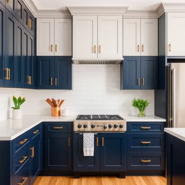
Darker colors carry more visual weight. Placing a deeper blue shade on the base cabinets grounds the room, while a pale grey on the upper cabinets keeps the ceiling line feeling open and airy. This approach works exceptionally well in kitchens with lower ceiling heights or limited natural light.
5 Practical Layout Approaches for Two-Tone Cabinets
1. Darker Base Cabinets with Lighter Uppers
This is the most common way to style two-tone cabinetry. Painting base units in a rich slate blue or dark navy hides scuffs, footprints, and daily wear in high-traffic zones. Coating the wall cabinets in a soft dove grey reflects incoming window light, helping the kitchen feel larger than its footprint suggests.
2. A Standout Kitchen Island
If you prefer to keep your perimeter cabinets uniform, use your island as the accent piece. Painting the main runs of cabinets in a gentle grey and coating the island in a contrasting blue creates a clear centerpiece for gathering.
3. Vertical Zoning for Tall Accent Walls
Tall pantry units, built-in refrigerator surrounds, and wall ovens can feel massive if painted in a dark tone. Keeping pantry towers in the same soft grey as your upper cabinets prevents them from looming over the rest of the layout.
4. Anchoring Floating Shelves with Grey Backing
If you are replacing upper cabinets with open shelving, paint the wall behind the shelves in a soft grey tone and keep the base cabinets a solid blue. This establishes visual separation without relying on heavy overhead boxes.
5. Mixing Materials Alongside Paint
You do not have to restrict yourself to painted wood on both sections. Pairing a painted blue island with natural grey-washed oak base cabinets brings physical texture into the room alongside tone variation.
Balancing Cool and Warm Undertones
One common mistake homeowners run into with grey and blue palette choices is mismatched undertones. Both blue and grey can lean cool with green or purple undertones, or warm with yellow and brown undertones.
-
Cool Greys and Steel Blues: These work best in sunny, south-facing rooms. The natural warm sunlight softens the cool undertones, keeping the space crisp and clean.
-
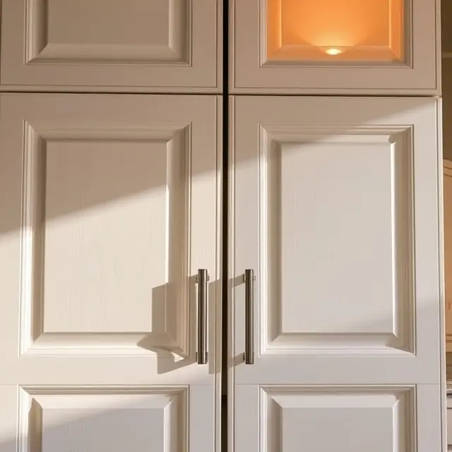
Warm Greys (Greige) and Slate Blues: If your kitchen faces north or lacks large windows, cool grey can look gloomy under artificial light. Choosing a grey with a warm beige undertone keeps the space inviting.
Selecting Countertops and Backsplash Tile
When you introduce two distinct colors to your cabinetry, your countertop and backsplash choices need to connect the elements rather than compete with them.
| Feature | Recommended Choice | Why It Works |
| Countertops | White Quartz with Fine Grey Vein | Bridges blue and grey seamlessly |
| Backsplash Tile | Matte White Subway or Zellige | Keeps the focus on cabinet shades |
| Hardware Finish | Warm Brass, Champagne Bronze, Black | Adds warm contrast to cool tones |
A solid white or subtle grey-veined quartz countertop works better than heavily patterned granite. The clean surface gives the eye a place to rest between the upper and lower cabinet colors. For the backsplash, classic white subway tile or a warm zellige tile maintains interest through texture rather than bold patterns.
What Does Cabinet Refacing or Repainting Cost?
Updating cabinetry layouts does not always require knocking down walls or purchasing custom boxes from scratch. If your current cabinet boxes are structural and square, repainting or refacing can save thousands of dollars.
| Project Scope | Estimated Cost Range | Ideal Candidate |
| DIY Cabinet Painting | $200 – $600 | Solid wood/MDF in good condition |
| Professional Cabinet Painting | $2,200 – $4,500 | Homeowners wanting factory finish |
| Professional Cabinet Refacing | $4,500 – $9,000 | Changing door styles/veneers |
| Full Custom Cabinet Replacement | $12,000 – $28,000+ | Changing overall layout/footprint |
Costs vary based on kitchen size, regional labor rates, and door construction details. Hiring a professional painter who uses spray equipment generally yields a smoother, factory-like coating than rolling paint by hand.
If you are planning to update your door profiles during this refresh, you can explore our complete guide on shaker style kitchen cabinets to see how different frame styles hold two-tone finishes.
Smart Hardware Choices to Tie the Look Together
Hardware acts as the jewelry of the kitchen. Using the same hardware style across both cabinet colors holds the design together.
-
Brushed Brass and Champagne Bronze: Warm gold tones contrast sharply against cool blue lowers, creating a high-end look without feeling overly formal.
-
Matte Black: Offers an industrial edge that grounds lighter grey upper cabinets.
-
Polished Nickel: Provides a subtle, classic shine that blends smoothly into cool-toned blue and grey paints.
If you want to vary handle types, keep the metal finish identical throughout the room. Use knobs on upper doors and matching bin pulls or handles on lower drawers.
Avoiding Common Two-Tone Cabinet Mistakes
-
Choosing Two Dark Tones: Pairing midnight blue with dark charcoal grey drains light out of the room. Always ensure one shade is noticeably lighter than the other.
-
Ignoring Lighting Conditions: Paint chips look different under showroom fluorescent lights than they do under your home’s 2700K LED bulbs. Always paint sample boards and observe them in your kitchen at morning, noon, and night before buying full gallons.
-
Overcomplicating the Pattern: Avoid checkerboarding colors across individual doors. Stick to horizontal splits (dark lower, light upper) or designated accent sections like an island or pantry bank.
If you are working within a compact footprint, like a standard 100-square-foot space, check out our breakdown on 10×10 kitchen layout ideas for spacing and clearance recommendations.
Realistic Maintenance for Blue and Grey Cabinets
Dark blue lower cabinets show dust, flour spills, and water spots more quickly than medium grey or natural wood finishes. Keep a soft microfiber cloth and a gentle soap solution nearby to handle daily wiping around handle zones.
Matte paint finishes hide surface imperfections well, but they can be harder to clean without scrubbing off the finish over time. Satin or semi-gloss finishes offer better moisture resistance and wipe down easily, making them a better choice for busy cook spaces.
For more details on managing your renovation budget, take a look at our breakdown on cabinet refacing costs guide to see if refreshing your existing frames fits your overall project plans.
How to Get Started with Your Cabinet Refresh
Start small by ordering paint samples and testing them against your existing flooring and countertops. Pick your primary blue shade first, then find a complementary grey that shares similar undertones.
When you get the lighting, contrast, and hardware aligned, two-tone cabinetry delivers a custom look that elevates the whole home.

